
Illustrations that explain, reassure, and delight.
Hero art, empty states, and spot illustrations.
Three types, one vocabulary.
Illustrations are used to enhance communication and provide visual context across the interface. They include hero illustrations, empty states, and spot illustrations — each serving a specific purpose. This section covers how to use them effectively across different scenarios.
Hero illustrations
Large compositions that set tone on landing pages, onboarding, and marketing surfaces.
Empty states
Small, focused art that replaces blank areas — lists, inboxes, and boards with no data yet.
Spot illustrations
Simple, purposeful visuals that highlight a concept or add interest inside a feature.
Set the scene.
Hero illustrations help communicate ideas, enhance user experience, and add visual context across the interface. Organized by different types and use cases.

Illustrations are designed as a single asset that supports both light and dark themes. Instead of maintaining separate files, opacity adjustments adapt colors across themes — keeping consistency while reducing asset duplication.
Neutral first, accent with intent.
Colors are used to create visual balance, guide attention, and support meaning without overwhelming the interface. A neutral-first approach keeps illustrations subtle; accent colors highlight key elements and interactions.
75–80% base, 20–25% accent.
Color distribution defines how colors are proportioned within an illustration to maintain visual balance and clarity. Base colors dominate the composition; accent colors are used selectively to highlight key elements.
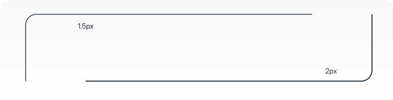
2px default, 1.5px for detail.
Stroke usage follows a consistent visual style. A 2px smooth stroke is the default. For finer details in tighter spaces, a 1.5px stroke may be used. Rounded caps and joins are applied consistently.
Fill the blank with guidance.
Empty states are parts of a user interface where there's no data to show — usually because of missing content, no search results, or no user actions. They give feedback and help guide users on what to do next, instead of leaving a blank space.

Illustrations are designed as a single asset that supports both light and dark themes. Instead of maintaining separate files, opacity adjustments adapt colors across themes — keeping consistency while reducing asset duplication.
Built on a 150 × 150 grid.
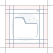
- Main grid size
- 150px × 150px
- Illustration range
- 100px – 130px
- Aspect ratio
- 1 : 1
- Stroke
- 1.2pt
- Corner radius
- 4px
- Padding
- 20px all sides
Subtle, with a single accent.
A neutral-first approach keeps visuals subtle, while accent colors are used sparingly to highlight key elements and reinforce meaning.
Small visuals with a single job.
Spot illustrations are simpler and more focused, serving specific purposes like highlighting a concept or adding visual interest.

Illustrations are designed as a single asset that supports both light and dark themes. Instead of maintaining separate files, opacity adjustments adapt colors across themes — keeping consistency while reducing asset duplication.
Built on a 200 × 150 grid.
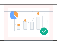
- Main grid size
- 200px × 150px
- Illustration range
- 120px – 180px
- Aspect ratio
- 4 : 3
- Stroke
- 1.2pt
- Corner radius
- 4px
- Padding
- 20px all sides
Spot illustrations follow the same visual and styling approach as character illustrations.